

Make navigating your website as easy as a walk in the park! Website navigation isn't just a design element; it's a core part of web design that serves as the roadmap for where visitors want to go and keeps them coming back for more. Website navigation is key to user experience and site success. Whether you're building an e-commerce site or a blog, designing effective navigation is crucial for conversions, reducing bounce rates, and improving search engine rankings, such as with Google.
Here's your ultimate guide to creating user-friendly website navigation that wows customers and turns browsers into fans. A well-planned website navigation structure is a vital part of web design, organizing menus and pathways so visitors can find information and move through your site seamlessly.
Why Website Navigation is the Unsung Hero of Online Success
Website navigation might not be as sexy as a new homepage design or as cool as social media content, but it's just an essential component of online success.
Here's why:
- Good User Experience: Smooth navigation = happy users! If visitors can find what they're looking for, they'll stay longer and engage more. Good navigation refers site visitors find what they need quickly and easily.
- Lower Bounce Rates: Frustrated visitors leave quickly. Proper navigation keeps them exploring instead of causing them to exit.
- Supports Goals: Want more newsletter sign-ups, purchases or inquiries? Clear navigation helps users to take the actions they want.
- SEO: Clear, organized navigation helps search engines, such as Google, understand your site more effectively, which in turn improves your ranking and visibility.
Your navigation design is the backbone of user experience and website functionality. Let's get started!
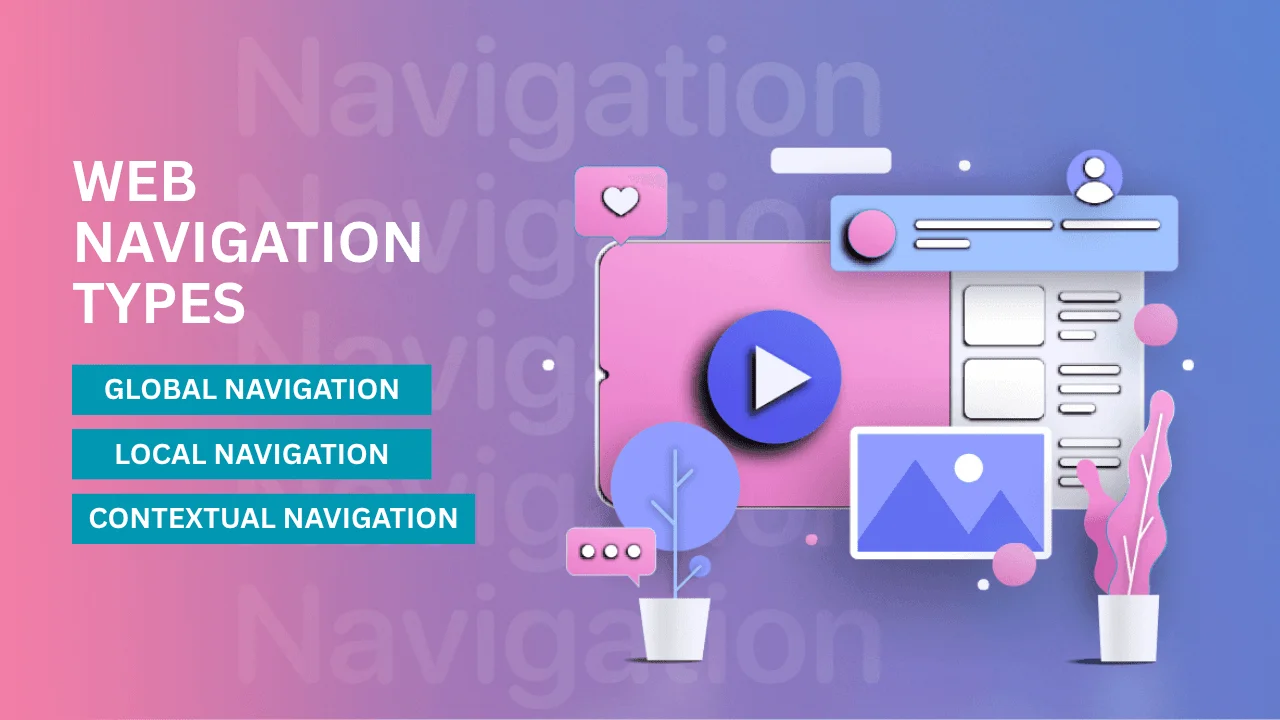
What Are the Three Types of Web Navigation?
When designing a website, it's essential to understand the main types of website navigation. Here are the three types of website navigation. Each type of navigation plays a specific role in usability.
Global Navigation
The main menu is the powerhouse of website navigation! A common good example is the horizontal navigation bar at the top of the page or a vertical sidebar navigation menu as an alternative layout for main menus. The main menu is composed of menu links that allow users to quickly access key sections, such as the homepage, about page, services, or contact information.
A clear, organized main menu—especially when using horizontal navigation or a horizontal menu—helps organize key site sections, provides quick access to important pages and is especially good for content-rich or mobile-friendly sites.
A well-structured main menu makes it easy for visitors to find what they need and move through your site. Want to keep users engaged and coming back for more? Get your main menu right! With a user-friendly layout, you'll create a seamless experience that boosts satisfaction and keeps your audience connected. Let's make navigation simple, effective and enjoyable!
Local Navigation
Local navigation is your secret weapon for guiding users to related content with ease and confidence. Found in specific sections or categories of a website, it helps users dive deeper into the details they care about. For example, a "Products" page could include local navigation links that direct users to different product categories.
A sub-menu can be used within local navigation to organize related categories or sections, making it easy for users to access deeper layers of content. It's all about making exploration simple, intuitive, and engaging—so users can find what they need faster and easily navigate to other pages within the same section.
Contextual Navigation
Embedded internal links are your secret weapon for engagement! These are hyperlinks placed directly within your content, giving users the opportunity to explore related or relevant topics in more depth.
Think of hyperlinked keywords, "read more" links or call-to-action buttons that guide users to other parts of your site. Use them strategically to keep your audience engaged and excited to discover what's next!
Each type of navigation plays a crucial role in usability and overall visitor experience. By combining them, you can ensure users never get lost and always stay engaged!
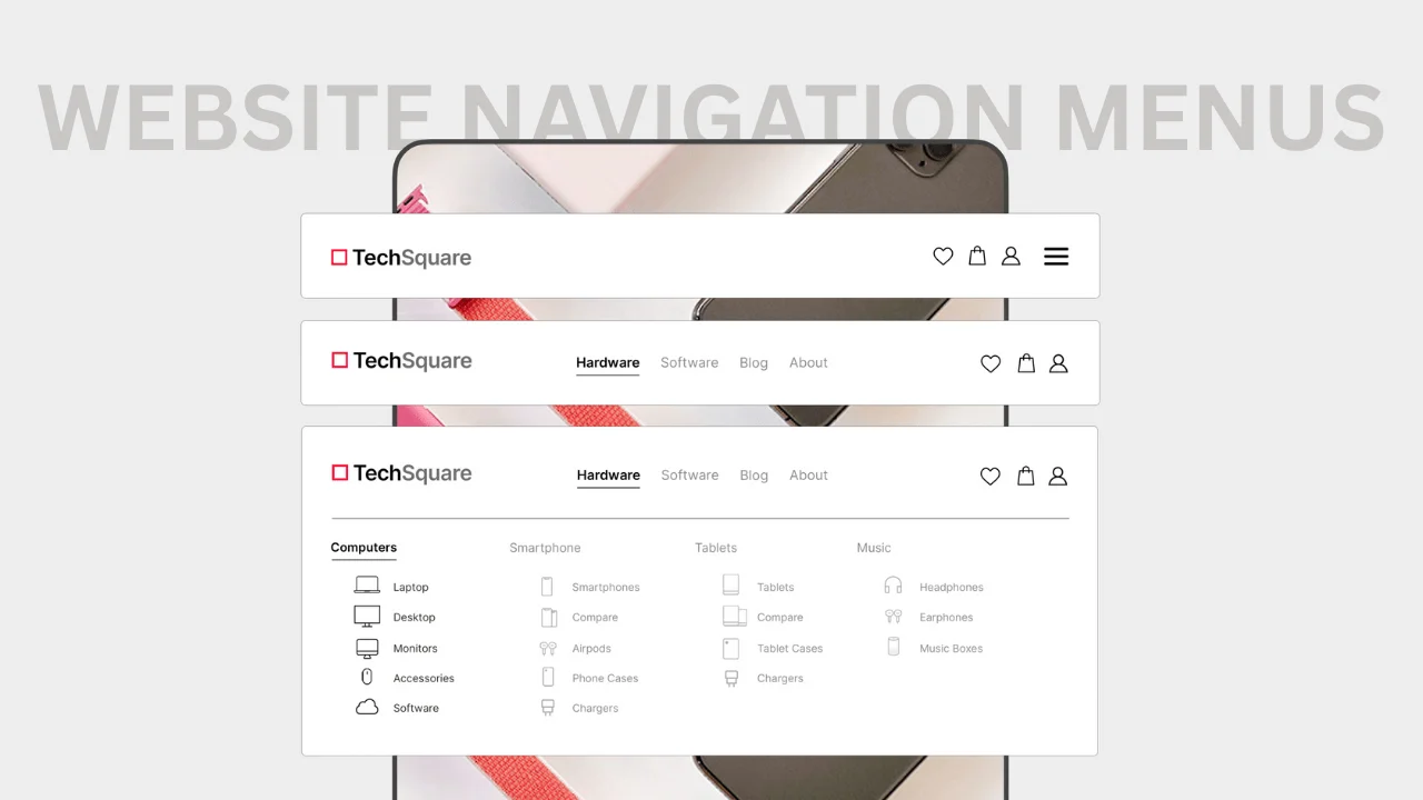
Website Navigation menus
Website navigation menus are your user's lifeline to a great website experience. A navigation bar is a common term for these menus, referring to the organized set of multiple links—such as horizontal top menus, vertical sidebars, dropdowns and mega menus—that help users navigate to important pages. Whether it's a simple dropdown or a mega menu, each type has its perks!
Primary Navigation Menus
Simple but mighty, primary navigation menus are often the first thing users interact with when they visit a site. Here's what makes them effective:
- Horizontal Menus: A row of text links across the top of the page is clean and intuitive. Good for sites with a few main categories.
- Vertical Menus: Think sidebars! Also known as a vertical sidebar menu or sidebar navigation, this type of menu stacks text links vertically on either side of the page. Great for blogs or sites with many nested pages, it can accommodate more links and improve user experience on content-rich sites.
- Dropdown Menus: Also known as dropdown menus, these add more subsections without overwhelming your layout. Dropdowns organize text links under primary categories and provide quick access to subcategories. However, complex dropdown menus can hinder usability and site structure; consider alternatives, such as mega menus or detailed pages, for improved accessibility and search engine optimization.
- Sticky Menus: Menus that stay fixed at the top of the page as users scroll make it easy to find key text links anytime.
Pro tip: Keep it concise and avoid cramming too many links into your menu. Simplicity is key!
Mega Menus
Mega menus are like navigation menus on steroids. Good for content-heavy sites and content-rich websites (like ecommerce sites, ecommerce stores or large blogs) with many categories and subcategories.
- Users love them because they consolidate lots of options into an easy-to-navigate layout.
- Search engines like them, too, as they make it easy to organize internal links, especially on an ecommerce site!
Mega menus are often integrated into the website's navigation bar (the top menu) to help organize numerous links and enhance the user experience.
But beware! Mega menus can get cluttered if not designed well. Keep it visually clean and easy to scan.
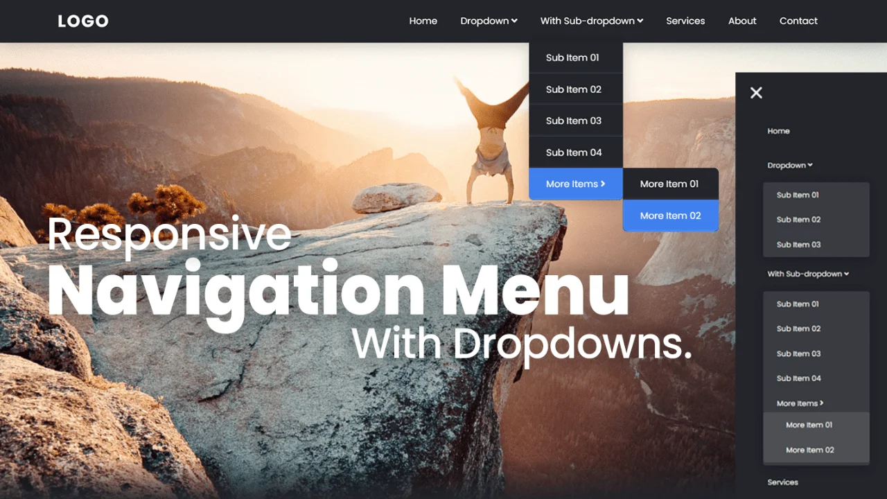
Menu Items and Organization
Menu items and organization are the foundation of any good website navigation menu. When users land on your site, they want to find what they need in as few steps as possible—so how you structure your navigation menus can make or break their experience.
A good practice is to keep your main menu simple and clutter-free; limit it to 5-7 essential links. This way, users aren't overwhelmed and can easily find the most important pages like "About," "Contact," or "Products." For content-heavy sites or e-commerce stores with numerous links and product pages, dropdown menus and mega menus are the preferred options. These allow you to organize a lot of website content into clear categories and subcategories, making navigation easy and efficient.
Descriptive link titles are key—users and search engines should know exactly where each navigation link will take them. Don't hide menus or bury important links; this will frustrate users and make it harder for search engine bots to crawl your site. Instead, ensure that all navigation links are visible and accessible across both desktop websites and mobile devices, utilizing responsive navigation design and best practices.
Web designers should always consider the site hierarchy when planning the navigation structure. A well-organized navigation menu not only guides users through your site but also helps search engines understand your content, boosting your search engine optimization efforts. Real-life examples of this can be seen on many websites, especially ecommerce sites that use mega menus to provide easy access to many product pages and categories.
In a nutshell, here are some navigation tips for your menu items:
- Use clear, descriptive titles for every menu item.
- Limit the main menu to 5-7 links for a streamlined user experience.
- Use dropdown menus or mega menus for content-heavy sites.
- Make sure all important links are visible and accessible—no hidden menus!
- Structure your navigation menu according to your site hierarchy and content priorities.
- Test your navigation on both desktop and mobile devices for consistency.
By following these website navigation best practices, you'll create a navigation menu that enables users to find what they need quickly, supports your SEO goals, and consistently delivers a positive user experience.
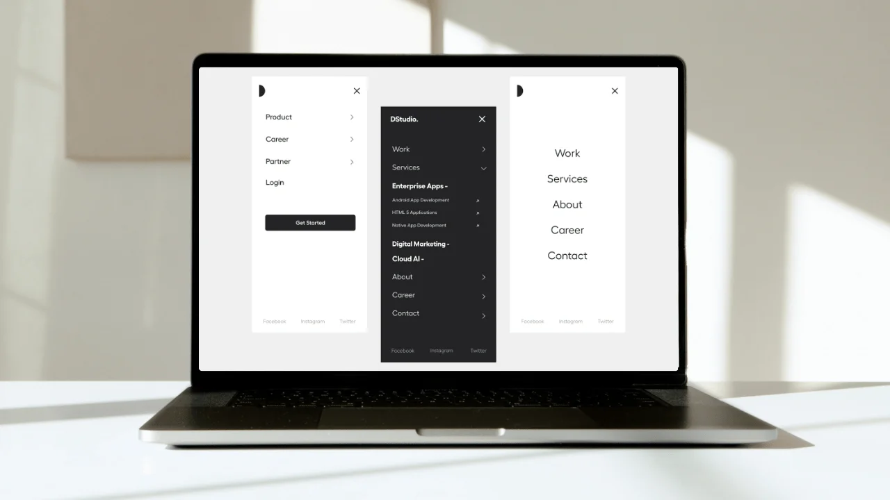
Website Navigation Best Practices
Want to create navigation that works like a charm? Follow these golden rules to keep your website at its best. Effective website navigation design has a direct impact on usability, making it easier for visitors to find what they need.
Navigation means the system of links and menus that guide users through your website, organizing the hierarchy and flow for both user experience and search engine indexing. Well-designed navigation also supports the user journey by making important information accessible and reducing friction as users move through your site.
- Be Clear and Concise Users shouldn't have to guess where a link takes them! Use descriptive labels, such as "Shop Women's Clothing," instead of vague ones like "Products." At first glance, users should immediately know where each menu item will take them.
- Prioritize Key Pages Put your most important web pages in the main navigation menu. Think Home, About Us, Contact, Products/Services.
- Be User-Friendly Across Devices Test your navigation on mobile and desktop. Mobile-friendly menus, such as hamburger icons (the three-line menu button), keep things clean and functional for small screens.
- Add Search Functionality Include a search bar for quick access to specific content.
- Stick to the Rule of Three Clicks Users should find what they're looking for in three or fewer clicks. If your navigation is intuitive, users won't get lost.
- Optimize for Accessibility Use contrasting colours, readable fonts and keyboard-friendly designs to make sure everyone can use your site with ease. Tools like ARIA (Accessible Rich Internet Applications) attributes help!
Remember these, and you'll build a navigation that makes an impact.
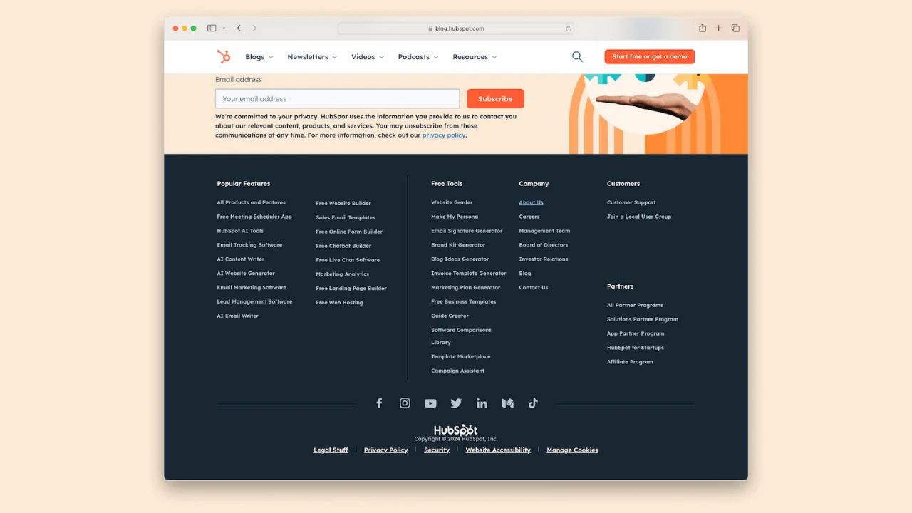
Footer Navigation Matters Too
Your footer is prime real estate for navigation! Also known as the footer menu or footer navigation menu, it's often overlooked, but a well-thought-out footer can act as a safety net for visitors who scroll to the bottom of your site.
Footer navigation helps website visitors find important links, legal information, and contact details, and overall improves their experience on your site.
What to Include in Your Footer:
- Quick Links: Access FAQs, shipping information, privacy policies, and terms of service.
- Contact Information: Make it easy for users to reach out.
- Social Media: Add icons to enable users to connect with your brand across various platforms.
Navigation for Mobile and Landing Pages
Mobile-first design is non-negotiable in today's digital world. Over 54% of global web traffic comes from mobile devices, so navigation on both your mobile site and desktop site is a must.
Mobile Navigation Tips:
- Use hamburger menus to save space.* Make links big enough to tap with your finger.
- Minimize dropdowns to avoid frustration.
Landing pages are a different ball game. Remove distractions and guide users to a clear call-to-action (CTA). A clean menu or no menu at all often works best here.

Use Analytics to Tweak Your Navigation
Do you know how users are using your site? Google Analytics is your best friend for navigation tracking and optimization.
You'll Learn:
- Which links get the most clicks?
- Where are users getting stuck?
- How do mobile and desktop behave differently?
Use this data to adjust your layout so it meets your users' needs and your business goals.
Get Started with Perfect Navigation
Building website navigation doesn't have to be scary. With the right approach, you can create a system that makes your users happy, improves your site's functionality and even boosts your SEO.
Need help with a site that has seamless navigation? Our team of web designers is here to guide you through it all. When you prioritize navigation, you're giving your users a better experience and setting your site up for success!
