
Web design has come a long way since the early days of the internet, from simple static web pages to dynamic, interactive experiences that work across countless devices and browsers. At the heart of this evolution is a fundamental approach that every web developer must master.
This comprehensive guide will take you through everything you need to know about the essential models in web designing, from the basics to advanced strategies. Whether you’re just starting out in web design or looking to level up your skills, you’ll get actionable insights to supercharge your web development!
The web design model isn’t just a set of technical rules—it’s your roadmap to creating websites that connect with users and meet the highest standards of functionality and accessibility. Let’s dive into the world of modern web design and unlock your potential to create amazing digital experiences!
The Web Standards Model: Your Foundation for Success
The web standards model is the backbone of modern web design and you must master it to succeed! This powerful framework is built on a simple yet revolutionary idea: separate structure, presentation and behavior with HTML, CSS and JavaScript respectively.
Think of it like building a house. HTML provides the structural framework—the walls, floors and foundation. CSS handles the interior design—colors, layouts and visual styling. JavaScript adds the smart home features—interactive elements, dynamic content and user engagement tools.
Why Web Standards Matter More Than Ever
Following web standards isn’t just about playing by the rules—it’s about creating websites that work for everyone, everywhere! The Web Hypertext Application Technology Working Group (WHATWG) and the World Wide Web Consortium (W3C) maintain these standards so your websites work across different browsers and devices.
When you follow web standards you’re setting yourself up for amazing benefits:
- Universal compatibility: Your websites work perfectly on Chrome, Firefox, Safari and Edge
- Future-proof design: Standards-compliant sites adapt better to new technologies
- Improve SEO performance: Search engines love well-structured, standards-compliant code
- More accessibility: More users can access and enjoy your web content
- Less maintenance costs: Clean, standardized code is easier to update and maintain
The beauty of the web standards model is its flexibility and power. By separating concerns you can make big design changes without touching your HTML structure or add new functionality without breaking your layout!## Essential Web Technologies: Your Design Toolkit
Ready to build amazing websites? Let’s explore the essential web technologies that will be your best friends in the design process!

HTML: Your Structural Superhero
Hypertext Markup Language (HTML) is where every great website begins. Modern HTML5 gives you semantic elements that make your web content more meaningful and accessible. Instead of generic div tags everywhere, you can use header, nav, main, section, and footer elements that clearly communicate your page structure.
This semantic approach doesn’t just make your code cleaner—it dramatically improves accessibility for screen readers and other assistive technologies. Plus, search engines love semantic HTML, so you get better SEO results!
CSS: Your Design Powerhouse
Cascading Style Sheets (CSS) turn your basic HTML structure into visually stunning experiences. Modern CSS3 offers incredible capabilities that would have seemed like magic just a few years ago:
- Flexbox and Grid: Create complex layouts with ease
- Animations and transitions: Add delightful micro-interactions
- Custom properties: Build maintainable, scalable stylesheets
- Media queries: Craft responsive designs that look perfect on any device
The key to CSS mastery is understanding the cascade and specificity. When you truly get how styles inherit and override each other, you’ll write more efficient, predictable CSS that’s a joy to maintain!
JavaScript: Your Interactive Engine
JavaScript brings your websites to life with dynamic content and interactive features. Modern JavaScript (ES6 and beyond) offers powerful tools for creating engaging user experiences:
- DOM manipulation: Update content dynamically without page reloads
- Event handling: Respond to user interactions in real-time
- API integration: Connect to external services and data sources
- Progressive web app features: Create app-like experiences in the browser
Don’t worry if JavaScript seems scary at first—start with simple interactions and gradually build your skills. The MDN Web Docs are excellent resources for learning JavaScript fundamentals and advanced techniques!

Web Development: From Concept to Launch
Web development is where your creative vision meets technical execution and it’s amazing when everything comes together perfectly!
Client-Side Development: Creating Front-End Experiences
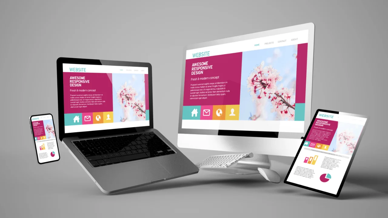
Client-side development is everything users see and interact with directly in their browsers. This is where your HTML, CSS and JavaScript skills shine! Modern front-end development is all about responsive web design so your websites look and work great on smartphones, tablets, desktops and everything in between. Use CSS Grid and Flexbox to create flexible layouts that adapt to different screen sizes.
Performance is key for client-side development. Optimize your images, minify your CSS and JavaScript files and use browser caching to create super fast user experiences. Every millisecond counts—faster websites = happier users and better search engine rankings!
Server-Side Development: Behind the Scenes Magic
Server-side development is the behind the scenes magic that makes modern web applications possible. Popular server-side languages are PHP, Python, Ruby and Node.js each with their own strengths for different types of projects.
Server-side development enables dynamic content generation, database interactions, user authentication and complex business logic. When combined with client-side technologies you can create powerful web applications that rival traditional desktop software!
Web frameworks like React, Vue.js, Angular, Laravel and Django provide structured ways to build scalable web applications. These frameworks offer pre-built components, routing systems and development tools that speed up your workflow while maintaining code quality.
Progressive Enhancement: Building for Everyone
Progressive enhancement is one of the most important principles in modern web design and implementing it correctly will set you apart as a thoughtful, skilled developer!
The Progressive Enhancement Philosophy
Progressive enhancement starts with a solid foundation of semantic HTML that works for everyone, then adds CSS for visual enhancement and finally JavaScript for interactive features. This way your website will work even when advanced features aren’t supported.
Think of progressive enhancement as building a beautiful, accessible staircase with an elevator. Everyone can use the stairs (basic HTML functionality), but those who can use the elevator (enhanced features) get an even better experience!
Feature Detection and Graceful Degradation
Modern browsers support feature detection through tools like Modernizr, so you can provide alternative experiences when certain features aren’t available. This way your websites will work across the entire spectrum of devices and browsers your users might use.
Graceful degradation works hand in hand with progressive enhancement. When a feature isn’t supported your website should degrade gracefully to a simpler but still functional alternative. For example if CSS Grid isn’t supported your layout will fall back to Flexbox or even simple block-level styling.
Designing for Mobile:
App-Like ExperiencesMobile-first design isn’t just a trend—it’s essential to reach your audience effectively! With mobile traffic accounting for over 50% of all web browsing your mobile experience can make or break your success.
Responsive Design Strategies
Start your design process with mobile devices in mind, then progressively enhance for larger screens. This mobile-first approach ensures your core content and functionality works perfectly on the most constrained devices.
Use relative units like percentages, ems and rems instead of fixed pixel values. This flexibility will allow your designs to scale beautifully across different screen sizes and zoom levels. CSS Grid and Flexbox are your best friends for creating truly responsive layouts that adapt intelligently to available space.
Touch-Friendly Interactions
Design for touch interactions by ensuring buttons and links are big enough for finger taps (at least 44px square). Provide enough space between interactive elements to prevent accidental taps. Consider implementing touch gestures like swipe and pinch-to-zoom where appropriate.
Loading performance is especially critical on mobile devices which often have slower connections and less powerful processors. Optimize images for different screen densities using responsive image techniques and consider lazy loading for content below the fold.
Universal Accessibility: Design for All Users
Accessibility isn’t just the right thing to do—it’s smart business! Making your websites accessible opens your content to everyone including the millions of people who use assistive technologies.
Semantic HTML for Screen Readers
Screen readers rely on proper HTML structure to navigate and understand your content. Use heading tags (H1-H6) in logical order to create a clear content hierarchy. Provide alternative text for images that conveys the same information or function as the visual content.
Form accessibility requires proper labeling, clear instructions and helpful error messages. Use the label element to associate labels with form controls and provide descriptive placeholder text and validation feedback.
Keyboard Navigation and Focus Management
Many users navigate websites exclusively with keyboards so ensure all interactive elements are accessible via keyboard navigation. Provide clear focus indicators so users can see which element has focus. Skip links allow keyboard users to jump directly to main content, bypassing repetitive navigation menus.
Test your websites with actual assistive technologies like screen readers. Tools like NVDA (free) and VoiceOver (built into macOS and iOS) will help you understand how users with visual impairments experience your content.
Best Practices: Your Recipe for Consistent Success
Following web standards and best practices consistently will transform your development workflow and create better outcomes for your users!
Code Validation and Quality Assurance
Use HTML and CSS validators to catch errors early in your development process. These tools will help you identify accessibility issues, performance problems and standards compliance issues before they hit your users.
Version control with Git allows you to track changes, collaborate with other developers and roll back problematic updates when needed. Establish consistent coding conventions and commenting practices to make your code more maintainable.
Performance Optimisation Strategies
Web performance affects user experience and search engine rankings. Optimize images by choosing the right formats (WebP for modern browsers, with JPEG/PNG fallbacks), compress files and serve the right sizes for different devices.
Minimise HTTP requests by combining CSS and JavaScript files where possible and use browser caching to reduce load times for returning visitors. Content Delivery Networks (CDNs) can speed up loading times for users worldwide.
Testing Across Browsers and Devices
Cross-browser testing ensures your websites work across different browsers and versions. Use tools like BrowserStack or CrossBrowserTesting to test on real devices and browsers without maintaining a huge testing lab.
Automated testing can catch regressions and ensure your websites keep working as you add new features. Unit tests for JavaScript functions, integration tests for user workflows and accessibility audits should all be part of your QA process.
FAQs
What’s the difference between web design and web development?
Web design is about the visual and user experience aspects of websites—layouts, colours, typography and user interface design. Web development is the technical implementation using HTML, CSS, JavaScript and server-side technologies. Many people combine both skill sets but they are different aspects of creating websites.
How important is mobile-first design?
Mobile-first design is super important! With mobile traffic dominating web usage, designing for mobile devices first ensures your core functionality works on the most constrained devices. You can then progressively enhance the experience for larger screens resulting in better performance and same experience across all devices.
What tools should I use to validate my web standards compliance?
The W3C Markup Validator checks HTML for standards compliance, the CSS Validator checks your stylesheets. Browser developer tools include accessibility audits and tools like axe or WAVE help you identify accessibility issues. Validate during development to prevent problems from hitting production.Follow MDN Web Docs for up-to-date documentation. Subscribe to newsletters like CSS-Tricks, Smashing Magazine and A List Apart. Join web development communities on Stack Overflow, GitHub and Twitter. Attend conferences, webinars and local meetups to connect with other developers and learn about the latest trends.
Should I learn frameworks or focus on vanilla HTML, CSS and JavaScript first?
Master the basics first! Understanding vanilla HTML, CSS and JavaScript gives you the foundation to understand how frameworks work and when to use them. Frameworks change frequently but core web technologies remain relatively stable. Once you’re comfortable with the basics, explore frameworks that fit your project needs and career goals.
Get Started with Web Design!
You now have the complete guide to the essential model in web design and the tools to implement it! The journey from learning to mastering these concepts takes practice, experimentation and continuous learning.
Start by implementing web standards in your next project. Focus on semantic HTML structure, clean CSS organisation and progressive enhancement principles. Test across different browsers and devices and don’t forget to validate your code regularly.
Remember great web design is technical excellence combined with creative vision and user empathy. The essential model provides the framework for technical excellence—now it’s time to add your own creative perspective and deep understanding of user needs.
The web design community is super supportive and always happy to help fellow developers grow. Engage with online communities, contribute to open-source projects and share your own learning experiences. Your journey to mastering the essential model in web design starts now—and the possibilities are endless!
Take action today: choose one concept from this guide and implement it in a current project. Whether it’s improving your HTML semantics, optimising for mobile devices or enhancing accessibility, every step forward makes you a better web designer. Your users will thank you and your career will benefit greatly from this commitment to excellence!
